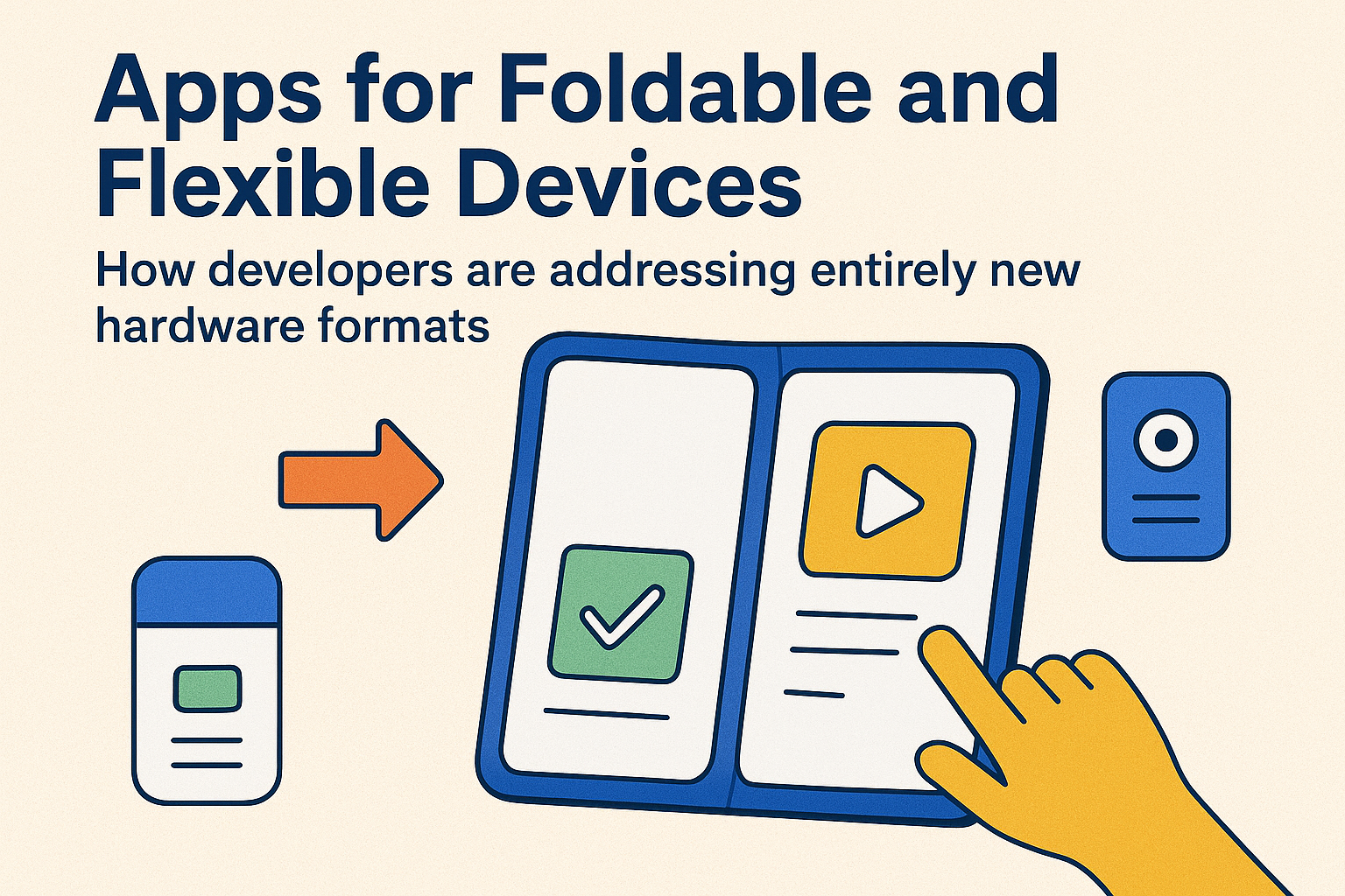
Apps for Foldable and Flexible Devices: How Developers Are Addressing Entirely New Hardware Formats

🌟 Introduction: A New Era of Screens
Remember when mobile phones only came in one standard form—a small rectangle that fit neatly in your pocket? Fast-forward to today, and we’re entering a bold new era with foldable and flexible devices. Whether it’s Samsung’s Galaxy Z Fold, Google’s Pixel Fold, or concept rollable screens, smartphones (and even tablets) are taking on shapes that once belonged in sci-fi movies.
For app developers, this is both a thrilling opportunity and a complex challenge. Building apps for foldables isn’t just resizing screens—it’s rethinking entire user journeys, UX design principles, and performance optimizations.
This blog explores how developers are addressing this radical hardware shift, the innovations shaping flexible displays, and the strategies making apps feel seamless on ever-changing screen realities.
📱 Why Foldables and Flexibles Are the Next Big Thing
Foldable and flexible devices combine portability with expanded screen real estate—a phone that transforms into a tablet instantly. For users, it’s not just novelty; it’s productivity, immersive media, and multitasking rolled into one.
- Bigger Canvas for Work & Play: Perfect for videos, gaming, and multitasking (side-by-side apps).
- Portability: Compact when folded, expansive when opened.
- Future Growth: Market analysts predict foldable shipments will cross 45–50 million devices annually by 2027.
This growth means that apps not optimized for foldables risk being left behind.
🔍 The Developer’s Challenge
Designing for a single screen size was hard enough—but foldables bring dynamic, shapeshifting scenarios:
- Multiple Screen States: Apps may need to transition from “phone mode” to “tablet mode” instantly.
- Screen Continuity: Switching mid-task shouldn’t cause glitches, reloads, or disorient the user.
- Multi-Window Support: Foldables encourage multitasking, requiring smooth parallel app handling.
- Hardware Diversity: From horizontal folds to vertical flips to scrollable/rollable panels, formats vary widely.
👉 Developers must now write smarter, flexible code that adapts fluidly—and do it without draining performance or killing the battery.
✨ Core Strategies Developers Are Using
So how are developers solving these challenges? Let’s break down the winning strategies:
1. Responsive, Adaptive Layouts 🖼️
Unlike past mobile-first designs, foldables demand multi-state design systems. Developers use constraint-based layouts (like Jetpack Compose in Android or SwiftUI) to ensure fluid transitions when the screen expands or contracts.
2. Seamless Continuity 🚀
Imagine watching a YouTube video on a folded phone… then opening it into tablet mode and the video continues seamlessly, no reload. This continuity is the gold standard. APIs like Android’s WindowManager let apps maintain session state gracefully.
3. Enhanced Multitasking ➕
Foldables support multi-active windows and drag-and-drop between apps. Developers are now building deep-link integrations and intent sharing to embrace this ecosystem. Productivity apps, in particular, benefit by offering split-screen workflows.
4. Gesture-First Navigation ✋
Flexible devices demand gesture-based UX. That means:
- Pinch-to-expand/join windows.
- Drag-and-drop across panes.
- Smooth swiping for folding transitions.
Gestures must feel natural and intuitive across folded states.
5. Conditional Motion & Animation 🎞️
Animations don’t just resize; they must morph. Responsive animations bridge the mental gap between “folded” and “unfolded,” making users feel continuity instead of disruption.
🛠️ Tools & Frameworks That Make It Work
Thankfully, developers aren’t starting from scratch. Major platforms are empowering foldable-first development with specialized tools:
- Android Jetpack Window Manager: APIs that handle window size changes, folding angles, and hinge areas.
- Flutter: Framework updates that allow dynamic screen resizing while keeping codebase single-source.
- React Native Flexibility: Libraries for adaptive layouts across multiple fold orientations.
- Samsung & Microsoft SDKs: Partnerships creating productivity-focused multitasking experiences.
- Canvas & Vector Animations (Rive/Lottie): Scale beautifully across fold states without pixelation.
The ecosystem is rapidly evolving to support this new frontier.
🌈 Design Innovation: Beyond Resizing
Foldable-specific apps aren’t just “bigger versions” of phone apps—they’re rethinking core user journeys. Some exciting patterns are emerging:
- Dual-Pane Experiences ➗
Example: Email apps showing inbox on one pane, email content on the other. A true productivity boost. - Drag-to-Preview Interactions 🔄
Imagine dragging a thumbnail from one side of the fold and seeing it expand into a full-screen preview on the other. - Adaptive Storytelling 📖
E-readers, manga, and magazine apps now use folds like real books, animating page turns naturally. - Gaming Immersion 🎮
Folded into compact controllers, unfolded into full immersive gameplay. Developers are enhancing UI/HUD positioning with folding in mind. - Camera Enhancements 📷
Folded states double as kickstands—streaming apps and camera UIs optimize layouts for tripod-free usage.
This isn’t just design adaptation; it’s design reinvention.
⚡ Examples of Foldable-First App Experiences
- Microsoft Office Apps: Fully optimized for split-pane work—edit a doc on one side, review notes on the other.
- Netflix & YouTube: Seamlessly expand video playback when unfolded.
- Spotify: Experiments with advanced playback controls on folded outer screens while lyrics display inside.
- Samsung Notes & Gallery: Leverage stylus + fold capabilities to mimic a real notebook.
These apps are leading the charge, setting expectations for others to follow.
🚧 Challenges Developers Still Face
Despite rapid progress, challenges remain:
- 🏗️ Fragmentation: Every brand’s foldable has unique dimensions and hinge mechanics.
- 🔋 Battery Efficiency: Bigger screens + animations = higher power draw. Optimizations are critical.
- 🎨 Design Consistency: Maintaining visual polish across multiple fold states is resource-heavy.
- ⚙️ Testing Complexity: Foldables require testing across dozens of folds, orientations, and multitask setups.
This complexity can slow rollouts for smaller dev teams.
🔮 What’s Next for Foldables & Flexible Apps
Looking into the near future, foldables open up entirely new territory:
- Rollable Screens 📜 → Apps adapting dynamically as displays slowly expand/contract like scrolls.
- Wearable Flexibles ⌚ → Smartwatches and bands leveraging adaptable display curves.
- AR + Foldables 🕶️ → Enhanced apps that sync with glasses or VR headsets for multi-screen ecosystems.
- AI-Powered Layouts 🤖 → Apps that intelligently rearrange content depending on fold angle, user preference, and context.
The central insight: Foldables aren’t just gadgets—they’re a bridge to a flexible, multimodal digital future.
💡 Best Practices Developers Should Adopt
To thrive in this wave, developers should:
- Design Multi-Modal Journeys: Think phone, tablet, and everything in between.
- Prioritize Continuity: No reloads—smooth state preservation is key.
- Optimize Performance: Efficient rendering + battery-friendly animations ensure real usage.
- Accessibility Always: Support reduced motion, larger fonts, and adaptable layouts.
- Test in the Real World: Emulators help, but foldables must be tested on real hardware for hinge physics and gestures.
📝 Conclusion: Building Beyond the Rectangle
Foldable and flexible devices are no longer gimmicks. They are reshaping how we think about app experiences. Developers who embrace this challenge aren’t just keeping pace—they’re pioneering the next generation of digital interactions.
This is more than adapting apps to fit screens—it’s about designing apps that grow, shrink, bend, and evolve with users’ lives.
In the coming years, the devices in our pockets won’t just be tools—they’ll be adaptable canvases. And developers, with creativity and technical mastery, will be the architects of these unfolding digital stories. 🌍✨