How Heatmaps and Analytics Can Improve UI/UX Decisions
What is a Heatmap?
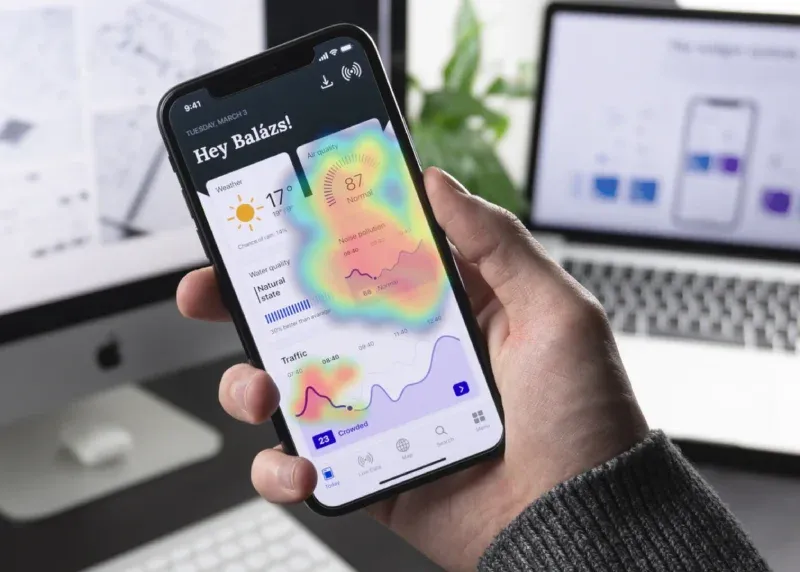
A heatmap is a visual tool in UX design that displays how users interact with a webpage or application. It uses colors to represent different levels of activity: warmer colors indicate areas of high interaction, while cooler colors show less activity. This visualization helps UX designers and researchers analyze user behavior, uncovering how visitors engage with different elements of a site or app.
Heatmaps provide valuable insights into user interactions, making it easier to answer key UX questions. Put simply, heatmaps are a rich visual interpretation of responses triggered by users interacting with digital systems. A typical characteristic of the visual interpretation of heat maps is the abstraction of large swathes of this user interaction data in actionable quant – elements with most clicks, pages with deepest scroll depths, and interface areas with the highest density of mouse movements, to name a few.
Examining heatmap data helps experts refine designs to align with user needs and behaviors. Heatmaps serve as a critical tool in UX optimization, allowing the detection of patterns that might not be apparent through traditional analytics alone. Whether assessing the effectiveness of a layout or identifying ignored features, heatmap analysis provides detailed insights.
With the evolution of heatmap tools, designers now have access to sophisticated software that can track everything from simple clicks to complex gestures, offering a comprehensive view of user engagement.
Why is Heatmap Analysis Important to Improve User Experience?
There are two types of data that can help you understand the current user experience: quantitative data and qualitative data.
Quantitative data is gathered using research tools like Google Analytics (GA). The problem with relying on quantitative data alone is that even though it can give you a performance number against each metric that you track, it, however, fails to provide any insight into the reason behind the performance – good or bad.
For example, if a visitor churned when moving from stage A to stage B in their journey, quantitative data will only tell you that they churned and not why they churned.
And this is where website heatmaps, a qualitative UX research tool that tracks and visualizes visitors’ on-site or on-page behavior, come into the picture.
The first thing to keep in mind when designing an interface or when designing for better user experience is that this process is a continuous one – there is no one final, fixed design that will work forever. People change their choices and often modify their needs.
This, coupled with the large number of updates on every digital platform, calls for continuous design iterations and hence, makes the exercise of gathering, analyzing, and leveraging user interaction data ever more important.
And what better way to achieve this than leveraging the power of a robust website heatmap tool? Heatmap tools tell you exactly what works and what doesn’t and also provide actionable data, so the changes you make are data-backed.
Different Types of Heatmaps
As UX tools, heatmaps provide versatile insights into user behavior. They come in several forms, each tailored to gather specific types of interaction data.
- Click Maps: Track where users click on a page, providing insight into what catches their attention. More clicks indicate higher engagement from visitors. This insight can help enhance site navigation by arranging elements to align with visitors’ expectations and behavior.
- Scroll Maps: Show how far down users scroll on a page. This data is crucial for understanding how much of your content is being seen by users, helping optimize content placement.
- Movement Maps: Record users’ mouse movements. They offer insights into how users navigate a page, highlighting areas where they may pause or show hesitation.
- Dynamic Heatmaps: Help analyze visitors’ engagement with interactive elements such as pop-ups, sliders, and dynamic content. Recording visitor data in real-time on the live state of your website helps you quickly identify potential issues before they impact conversions.
- Click Areas: Allow users to select and compare multiple areas on a webpage simultaneously, providing a comprehensive understanding of visitors’ preferences through interaction comparison.
How Heatmaps Came to Dictate UX in Omnichannel Experiences?
There is no second-guessing that the credit for the dominance of website heatmaps when it comes to designing for a stellar UX majorly goes to the incomparable, quality insights on visitors’ on-site behavioral trends that they arm marketers and UX designers with.
But, there is another element at play here that appears to be slowly becoming a major contributor to this dominance, namely omnichannel experience.
The aggregate experience that a website delivers to each visitor, across devices is an omnichannel experience.
That being said, we live in an age where each individual can own a desktop, a mobile phone, a tablet, or any other device all at the same time. And they use all of these devices to browse through different websites and sometimes, the same website using different devices. In a conundrum like this, where there is no certainty about which device a visitor starts their journey on, and on which they end it, it becomes imperative that the interface be designed in such a manner that each element is in its most optimized form and is consistent in delivering a good user experience throughout the journey, across devices.
Delivering a good omnichannel experience to each visitor has become everything now, and this is why website heatmaps have gained a further impetus into assuming a pivotal position in the entire UX designing process.
How Can You Combine Heatmaps with Other UX Tools?
Session Recordings: Integrating session recordings into your qualitative research provides deeper context for your heatmap data. For example, if heatmaps show a surge in clicks on the ‘add-to-cart’ button compared to the ‘checkout’ button, session recordings may reveal hesitation before checkout, prompting further investigation.
On-Page Surveys: Surveys offer direct user feedback. If users frequently click a course description but don’t enroll, an on-page survey can reveal what additional details they seek before making a decision.
Form Analytics: If heatmaps highlight high engagement on a form but a drop-off at a particular field, form analytics can pinpoint friction points, guiding targeted optimizations.
How Analytics Can Improve UI/UX Decisions?
Analytics plays a crucial role in enhancing UI/UX decisions by providing data-driven insights into user behavior. While heatmaps provide a visual representation of engagement, analytics tools like Google Analytics, Hotjar, and Mixpanel offer deeper data on user journeys, conversion rates, and engagement metrics.
By analyzing bounce rates, session durations, and conversion paths, designers can identify weak points in the user journey. For example, if a checkout page has a high abandonment rate, analytics can pinpoint where users drop off, helping refine the UI elements and interactions to enhance conversions.
Integrating analytics with heatmaps allows UX teams to gain a holistic understanding of user behavior, enabling data-backed optimizations that lead to better usability and customer satisfaction.
Conclusion
Both heatmaps and analytics serve as powerful tools in optimizing UI/UX. While heatmaps visually highlight engagement areas, analytics provide deeper numerical insights into user interactions. Together, they empower designers and marketers to make data-driven decisions that enhance user experiences and improve conversion rates. By integrating both, businesses can create seamless, engaging digital experiences that cater to user needs effectively.
With the entry of testing in the picture, the Heatmap-UX duo only got stronger. It is only a matter of time that like CRO and UX/UI, website heatmaps will come to assume central positions in other fields of the online world as well.