The Power of Color Psychology in UX/UI Design: Enhancing User Experience and Digital Engagement

Introduction
In the realm of digital marketing, user experience (UX) and user interface (UI) play a critical role in shaping how users interact with websites and applications. Among the many elements that contribute to an effective UX/UI design, color stands out as a powerful tool. Color psychology, the study of how hues influence human behavior, plays a crucial role in shaping user perceptions and interactions with digital interfaces.
This article delves into the principles of color psychology, offering insights into how to select the ideal color palette to enhance engagement, drive conversions, and create an impactful digital presence.
The Significance of Color in UX/UI Design
Color is more than just a visual phenomenon; it is a powerful communication tool that evokes emotions, influences perceptions, and drives actions. In digital marketing, first impressions matter, and color plays a key role in shaping those impressions. A study by the Institute of Color Research found that people make a subconscious judgment about a product within 90 seconds of viewing it, and up to 90% of that assessment is based on color alone.
Understanding Color Psychology
Different colors evoke different emotional responses, making it essential to choose colors strategically based on the intended impact on users. Below is an overview of common colors and their psychological associations:
- Red: Energy, passion, urgency. Used frequently in clearance sales and to stimulate quick decisions.
- Blue: Trust, calmness, reliability. Popular for corporate and healthcare websites.
- Green: Nature, growth, tranquility. Common in environmental and health-related content.
- Yellow: Happiness, warmth, but also caution. Often used for attention-grabbing elements.
- Black: Sophistication, elegance, power. Frequently seen in luxury brand designs.
- White: Simplicity, purity, cleanliness. Common in minimalist and healthcare designs.
Color Preferences Across Different Demographics
Understanding your target audience's preferences is crucial in selecting a color palette that resonates effectively.
Gender-Based Preferences
Research suggests that color preferences vary by gender. Blue is universally favored, while purple tends to be more popular among women and less preferred by men. Additionally, women generally favor softer colors, while men prefer bolder hues.
Age-Based Preferences
Younger users typically gravitate toward vibrant and bright colors, whereas older audiences prefer more subdued and classic tones. Tailoring color choices based on these preferences ensures a more engaging user experience.
Cultural Considerations
Cultural differences significantly impact color perception. For example:
- In Western cultures, white symbolizes purity (weddings) but is associated with mourning in some Eastern cultures.
- Red signifies good fortune in China but denotes danger in Western contexts.
- Green is associated with prosperity in the Middle East, while in some Latin American countries, it can represent death.
- Blue is widely accepted as a calming and trustworthy color across many cultures.
- India: Saffron holds spiritual significance, red symbolizes marriage and prosperity, and green is often linked to growth and festivity.
When designing for a global audience, understanding these cultural nuances prevents misinterpretation and ensures effective communication.
Color Theory and UX/UI Design
Applying color theory helps create visually appealing and harmonious designs. Key concepts include:
- The Color Wheel: A tool that organizes colors into primary, secondary, and tertiary categories, helping designers create balanced palettes.
Color Harmony: Aesthetic combinations that create pleasing visuals, such as:
- Analogous Colors: Colors next to each other on the wheel (e.g., blue, green, yellow) create a natural flow.
- Complementary Colors: Opposites on the wheel (e.g., red and green) provide high contrast.
- Triadic Colors: Three evenly spaced colors (e.g., red, yellow, blue) offer a vibrant balance.
Applying Color Psychology in UX/UI Design
To make the most of color psychology in UX/UI design, consider the following strategies:
1. Establish Your Brand Identity
Color should align with brand values. A tech company might use blue for trust and innovation, while an organic food brand might choose green for health and sustainability.
2. Consider Emotional Impact
Choose colors that evoke the desired emotions. For urgency, red is effective, whereas for reassurance, blue or green works well.
3. Prioritize Accessibility
Ensure color choices provide sufficient contrast for readability, especially for visually impaired users. Referencing Web Content Accessibility Guidelines (WCAG) helps create more inclusive designs.
4. Test and Iterate
User testing helps determine the most effective color choices. A/B testing different color schemes can reveal which combinations drive higher engagement and conversions.
Case Studies: Successful Color Usage in UX/UI Design
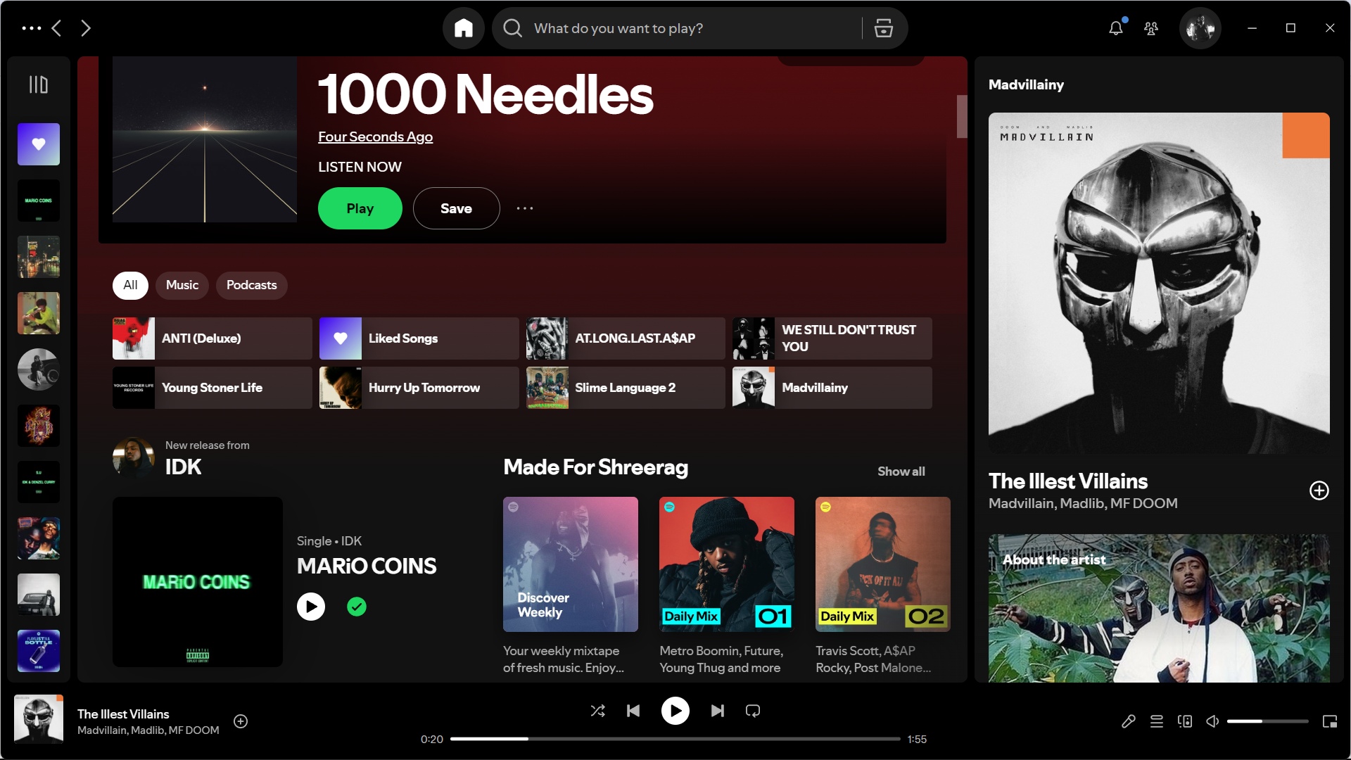
Spotify
Spotify’s dark theme with vibrant green accents creates a modern, dynamic identity. The green reinforces the brand’s emphasis on music discovery and energy.
Slack
Slack’s interface blends purple and blue, fostering creativity and trust. The scheme balances professionalism with approachability, aligning with its role in workplace communication.

Color Psychology and Conversion Rates
The impact of color psychology extends to conversion rates. Studies have shown that altering the color of a call-to-action (CTA) button can significantly affect user engagement. For example, a HubSpot study found that changing a CTA button from green to red increased conversions by 21%.
The UK Perspective: Color Preferences and Trends
In the UK, blue remains the most popular color, favored by 33% of Britons, followed by green at 15%. UK brands often leverage blue to build trust, particularly in financial services, while wellness brands frequently use green to convey health and sustainability.
Color Preferences in India: Design Trends and Popular Colors
In India, red is one of the most widely used colors in design, symbolizing prosperity, celebration, and vitality. It is frequently seen in wedding-related designs and festive branding. Green represents nature, growth, and harmony, making it a popular choice for eco-friendly and wellness brands. Additionally, gold is widely used in luxury branding, reflecting opulence and success.
Conclusion
Strategic color selection in UX/UI design is a powerful tool for enhancing user engagement, building brand identity, and increasing conversions. By understanding color psychology, considering demographic and cultural factors, and applying color theory effectively, designers can create digital experiences that resonate emotionally and drive success.
Incorporating these insights into your UX/UI strategy will ensure a strong digital presence that not only captivates users visually but also fosters deeper connections and higher engagement.