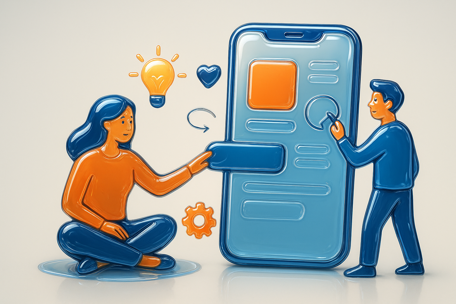
User-Centric Design: Building Products People Love
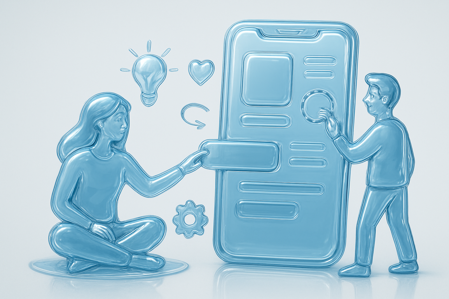
User-centric design means building products that truly resonate with people—prioritizing their preferences, real-world needs, and even their frustrations. Apple’s recent introduction of the “Liquid Glass” design across iOS 26, macOS Tahoe, and other platforms is a perfect reminder that even industry leaders must keep listening to their users and adapt as feedback rolls in.
The Launch of Liquid Glass
When Apple introduced the Liquid Glass look, the interface was celebrated for its expressive, fluid, and glass-like material that brought a dynamic, delightful layer to Apple’s ecosystem. It was translucent, with real-time reflections and a sense of dimensionality not seen before in Apple’s flat design era. Apps, buttons, and even notification panels embraced this clear, “colourless” glass effect, which reflected surroundings, making device interaction feel magical, unified, and modern.
The Problem: User Friction
However, the excitement around the colourless Liquid Glass soon met with mixed reactions. Many users and designers highlighted concerns around legibility and usability. The clear, glassy backgrounds—though stunning—were often too transparent. Text and icons would blur into animated wallpapers or busy backgrounds, making basic tasks less comfortable and even affecting accessibility for people with vision challenges. The outcry was not small: forums, reviews, and even professional designers pointed out that the design felt more like a visual statement than a user-centric enhancement.
From Colourless to Tinted: Listening to Users
This is where Apple demonstrated a commitment to user-centric design. The company started rolling out updates, beginning with iOS 26.1, that gave users options to adjust the transparency of Liquid Glass—or even switch to a Tinted Liquid Glass appearance altogether. The tinted version overlays subtle color hues to the glassy elements, providing greater contrast, clearer boundaries, and improved readability for text and icons. Not only do these tints make things more legible, but they also allow users to inject a little more personality into their device.
Apple’s decision to offer this tinting option was directly in response to widespread user feedback and criticism. Just as with past design changes (like moving Safari’s address bar), Apple monitored reactions, listened to user requests, and responded with new customization options—demonstrating that building products people love means taking criticism seriously and designing solutions that make users feel heard and empowered.
Why This Matters in Product Design
The Liquid Glass story is a reminder that beautiful visuals alone don’t guarantee a beloved product. What people want is an experience that’s effortless, inclusive, and—importantly—adaptable to their needs. By giving users both clear and tinted appearances, Apple transformed a polarizing design move into an opportunity for greater personalization and usability.
Ultimately, user-centric design is about seeing products not just as works of art, but as tools that should feel natural in people’s hands—and evolving them in partnership with the people who use them every day.